

La Grande Fête: In Conversation with DANIEL + EMMA
Playful, nostalgic and unmistakably bold, the objects at the centre of La Grande Fête transform familiar foods and everyday cravings into sculptural, functional design pieces. Created by design duo DANIEL + EMMA, the collection embraces colour, humour and a sense of joyful exaggeration, where snack foods become permanent objects of curiosity and delight.
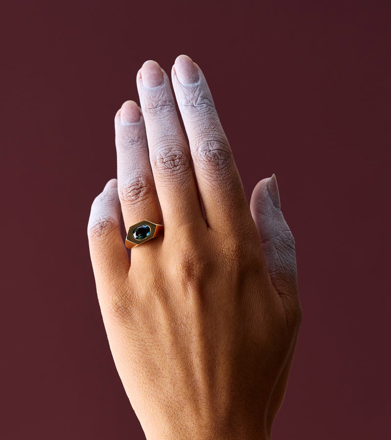
Presented as part of Melbourne Design Week, La Grande Fête invited contemporary jewellers to respond to these forms through the creation of a single ring, translating the visual language of each object into wearable art. The result is a vibrant dialogue between jewellery and design, where scale, material and imagination collide.
We spoke with Daniel + Emma about character, nostalgia, Australian culture and the thinking behind their delightfully playful world.

PO8: Your La Grande Fête objects have a strong sense of personality — chunky, colourful, a little bit cheeky. How do you know when a design has found its character?
D+E: We usually know it’s working when it makes us smile a bit in the studio. There’s a point where the form stops feeling like it’s being pushed and starts to feel inevitable, like it could only exist that way. For La Grande Fête, that meant leaning into excess in a very deliberate way: generous proportions, bold colour, and a kind of exaggerated simplicity. When it feels slightly too much, but still balanced, that’s often the sweet spot for character.
PO8: La Grande Fête is rooted in the joy of everyday cravings and a little nostalgia. Where did that starting point come from, and were there any snacks or sweets that felt particularly irresistible to design around?
D+E: It started quite simply with thinking about snacks you can’t quite resist; the ones that feel a bit nostalgic even if you’re still eating them now. Things like lollies from corner shops, ice cream treats, or anything wrapped in overly bright packaging. There’s a shared memory in those objects that’s quite universal. We were also interested in how food often carries a sense of occasion, even when it’s very every day. Something like a hot cinnamon donut on the beach in the sunshine can feel like a small celebration. That idea of turning something familiar into something a little more ceremonial really drove the collection.

PO8: Your studio describes its aim as creating work that is 'just nice', which sounds simple but feels quite intentional. Can you tell us what that means to you in practice?
D+E: ‘Just nice’ is a kind of filter for us. It’s about clarity, restraint, and not over-complicating things for the sake of it. It doesn’t mean plain; it means considered, calm, and quietly confident. In practice, it often means removing as much as adding. We ask whether something genuinely improves the object or whether it’s just noise. If it feels easy to understand, slightly generous in its presence, and has a bit of warmth to it, then it’s usually heading in the right direction.
PO8: You draw influence from the diversity of Australian culture. How does that show up in your design process?
D+E: It tends to show up in a very unforced way, in colour, in informality, and in the mix of references that sit alongside each other. Australia isn’t one single visual language, so we’re comfortable combining things that might not traditionally ‘belong’ together. There’s also a relaxedness in how people live here that we often try to hold onto in the work. A kind of openness and lack of preciousness. It means the objects can feel approachable rather than precious or distant.
PO8: If you could collaborate with anyone — a designer, an artist, a brand, a chef, an entire era of history — who would your ultimate dream collaboration be with, and what would you make together?
D+E: We often find ourselves drawn to the late 80s and early 90s as an interesting moment; less for a specific visual style, and more for the energy around it. It was a period where new technologies were emerging quickly, and there was a genuine sense of optimism and experimentation about what design could be in response to that. Alongside, there was a distinctive approach to branding and everyday objects at the time; from early digital interfaces through to highly considered product identities, including objects like cigarette packaging and branding, where graphic design, typography, and material finishes were used in very deliberate and culturally powerful ways. Not as something we’re referencing directly, but more as part of a broader moment where design was bold, immediate, and unapologetically communicative.
There was also a kind of looseness in how people were approaching form and communication at the time, before life became overly codified or refined. That freedom feels exciting to us. So, the dream would be to step into that moment and collaborate within that sense of momentum, where digital tools, early computing, and new production methods were just starting to influence how things were made. We’d be interested in what happens when that spirit of discovery meets our own tendency toward simple, physical objects, almost like translating that early tech optimism into something tangible, tactile, and a bit unexpected.
Head to Daniel + Emma's artist page to explore more of their striking, contemporary objects.

Read more

Piece by Piece is an ongoing journal series dedicated to examining individual works of jewellery with attention to material, form and intention. Each feature draws focus to a single piece or small...

Pearls are timeless symbols of elegance and sophistication, but unlike hardier gemstones, they require a little extra attention to maintain their exquisite lustre and remain beautiful for generatio...